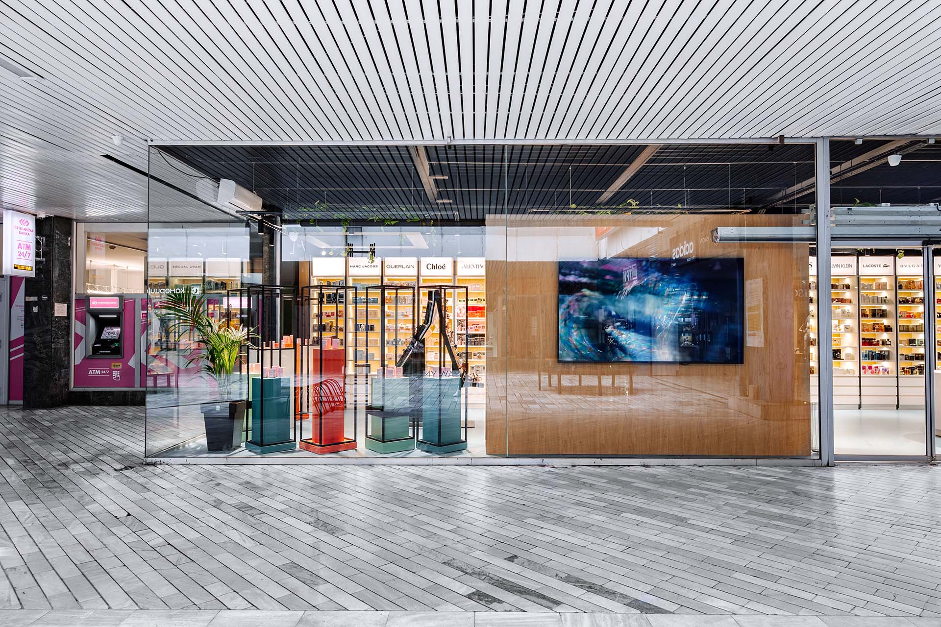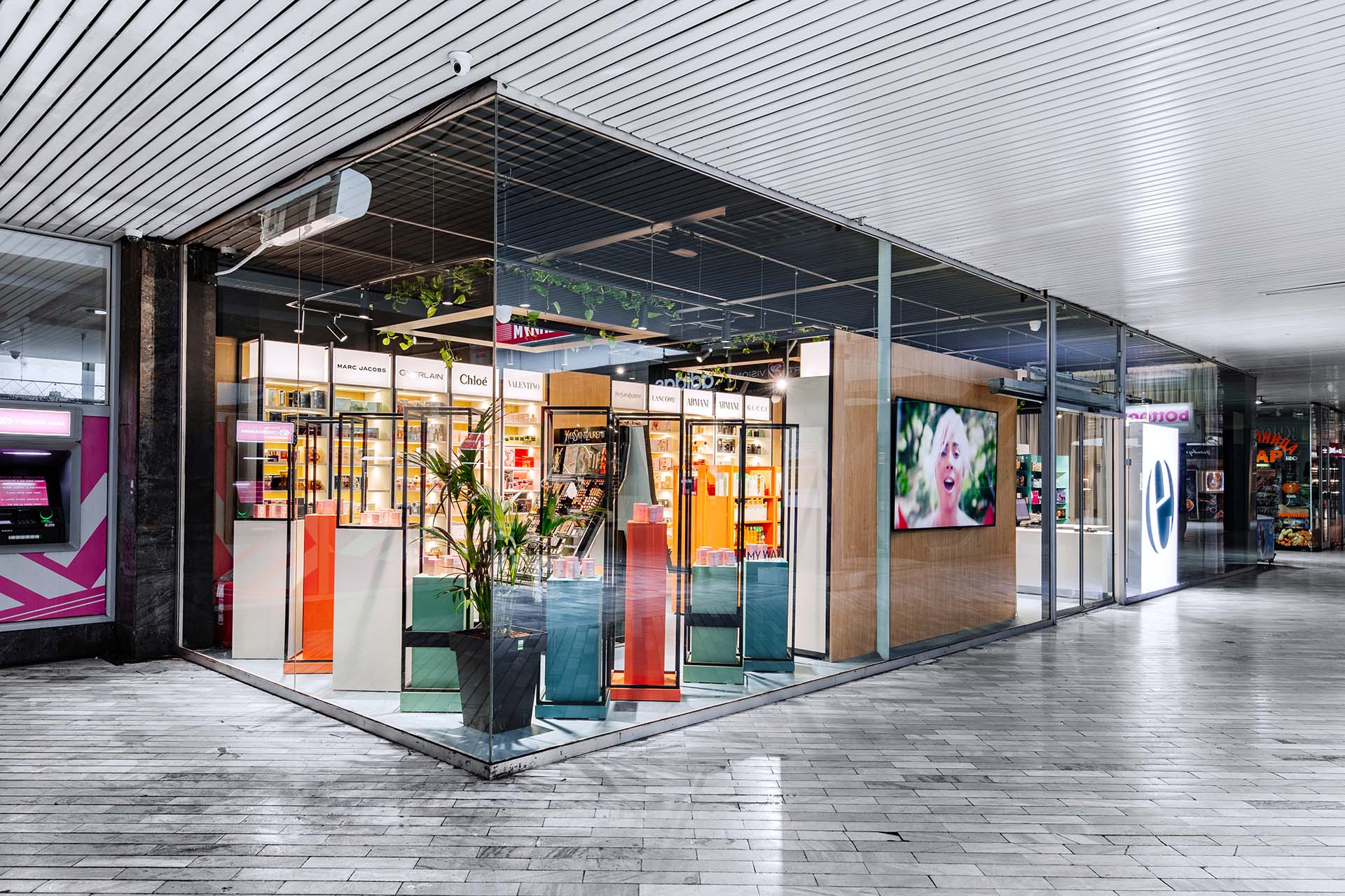
Located at the entrance of a shopping center in the heart of the city, Elixir is an important destination for shoppers seeking premium beauty products. The primary goal of our design was to create an open and transparent space that showcases all of the products, while maintaining a minimalistic aesthetic.To achieve this, we kept the window screens minimalistic with simple frames that match the other stores in the shopping center. On the corner of the store, we created a display for the most valued products. This feature helps to grab the attention of shoppers as they enter the shopping center and creates an eye-catching focal point.One of the challenges we faced was unifying the design of the shelves for the various brands of products. To overcome this, we developed a custom shelving system that works with all of the different brand products, creating a cohesive look throughout the store.In addition to the retail area, we also created a small space for customers to test the hair products. To provide some privacy, we added a curtain that can be pulled across the space when needed.The entire branding and design of Elixir was developed by our studio. We worked closely with the client to ensure that the final design reflected their brand values and objectives. The end result is a modern, open, and inviting space that customers will love to visit.
