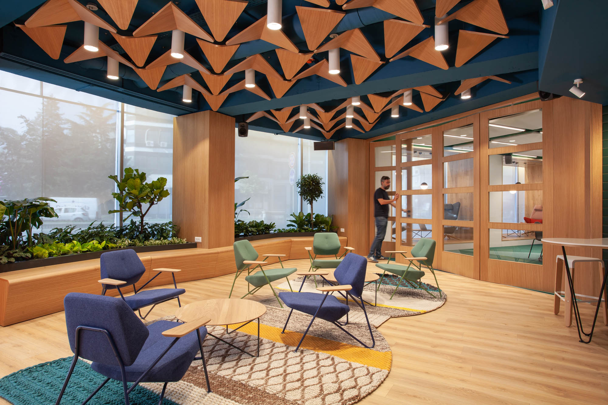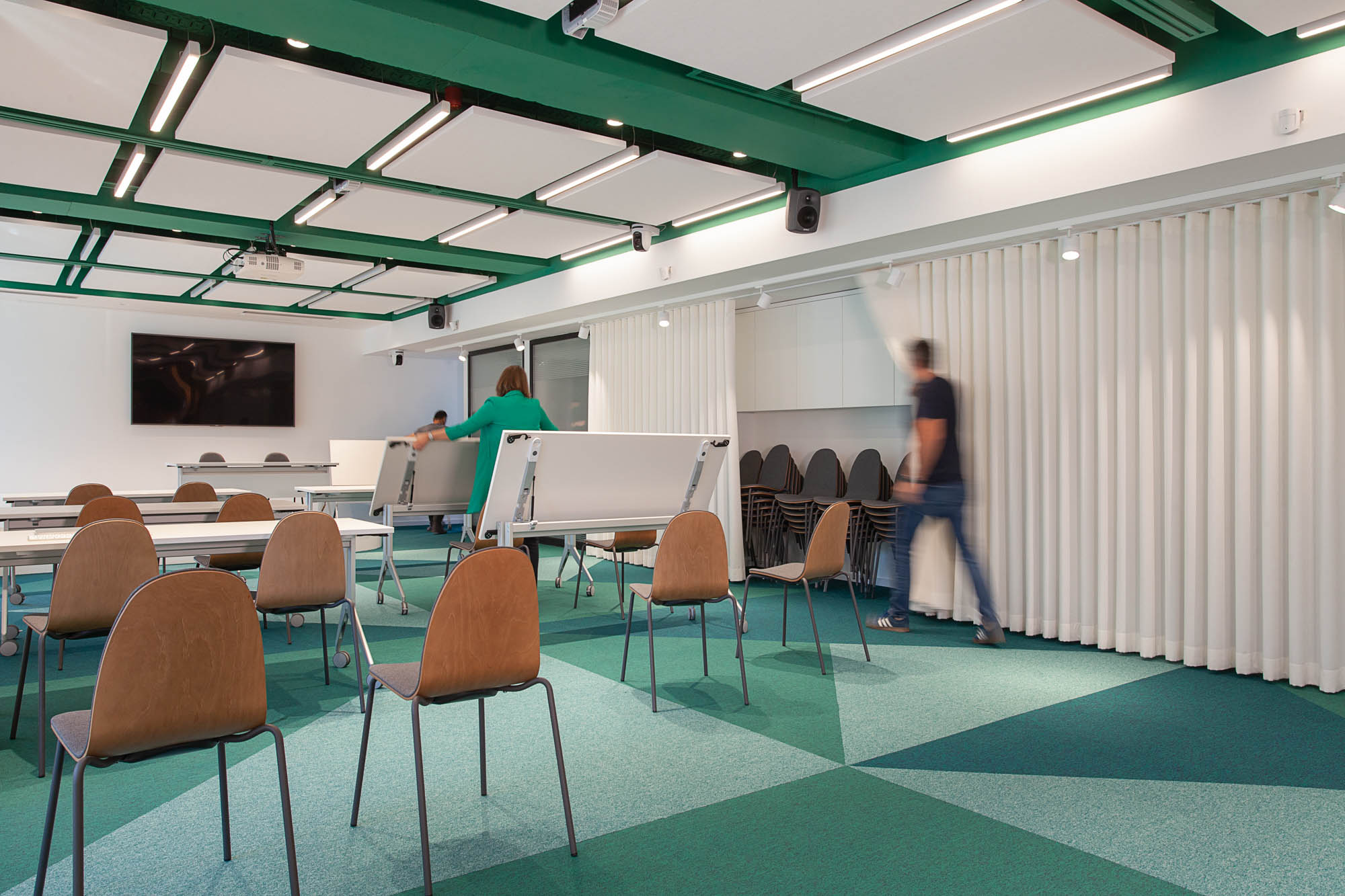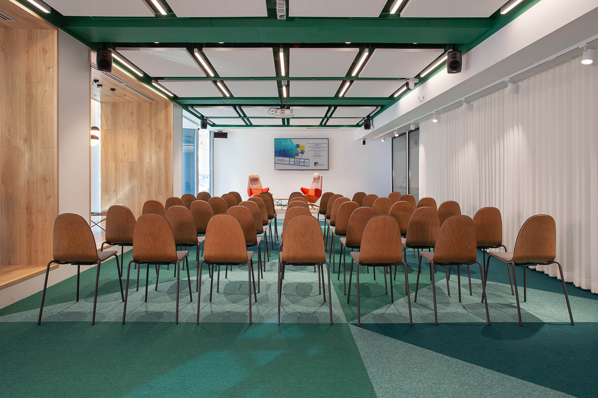
Our studio was selected to modernize the existing EU Info Center, which had an outdated design and functionalities. The client’s goal was to create a space that would attract young people, students, artists, and passers-by while also providing information about the EU. To achieve this, we paid special attention to the design of the window screen in order to make the space look attractive and welcoming from the outside. Next to the entrance, we added a jardinière with plants to link the indoor space with the exterior and create a welcoming atmosphere in the reception area. To attract the attention of passers-by, we designed arches and placed a big TV screen facing the street in the workplace area. This also provided privacy for the employees. We created “Boxes” with soft seating for relaxation and conversations in the conference area, between the existing columns. These boxes are welcoming and inviting from the sidewalk. We carefully selected easily movable furniture for the conference and reception areas to achieve multi-functionality. These areas can be easily adapted to different types of settings required for the diverse events that take place at the EU House. To allow users to easily change the setting of the room, we used the space along the conference area for storage of the conference chairs and tables. The curtains covering the stored furniture allow for smooth access and also work as sound absorbers. Overall, we are thrilled to have contributed to the modernization of the EU Info Center and believe that the new design will better serve the needs of the community.
Floor plan

